Unlocking Gateways
to Infinite Worlds
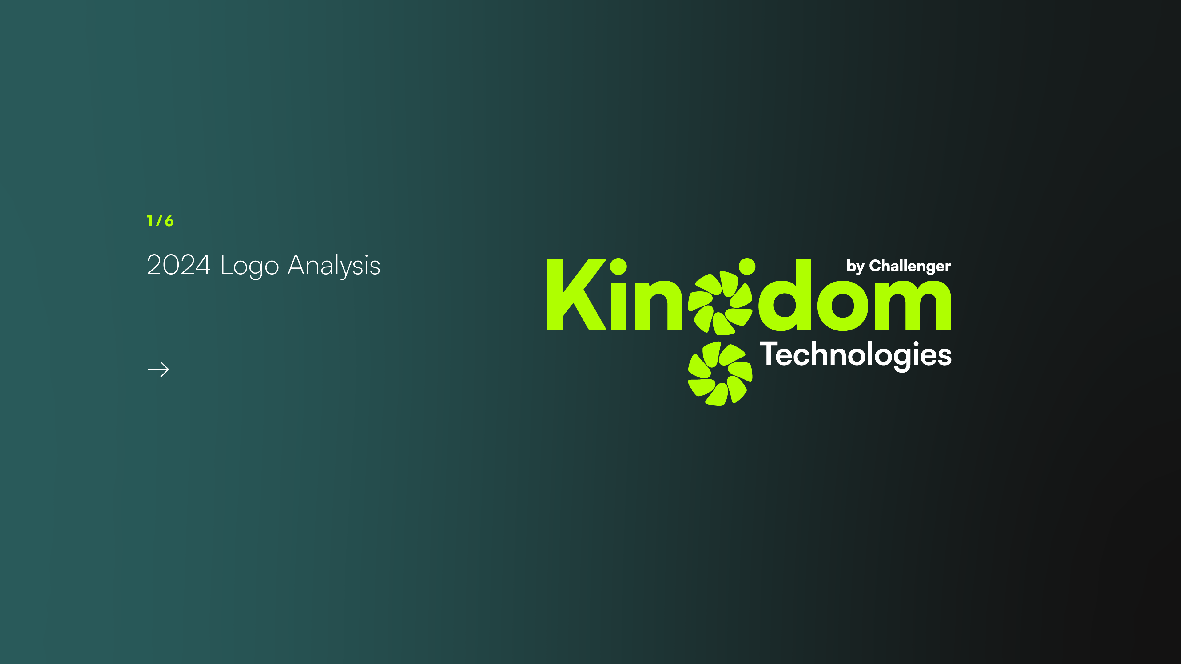
Client: Kingdom Technologies
Creative Direction by Shyon Toh.
About
Kingdom Technologies is a gaming-focused brand specialising in gaming PCs. Founded in 2021 as a subsidiary and investment arm of Singapore’s only homegrown consumer electronics chain, Challenger Technologies, the brand builds on the strong legacy of Challenger Technologies, which has been established since 1982.
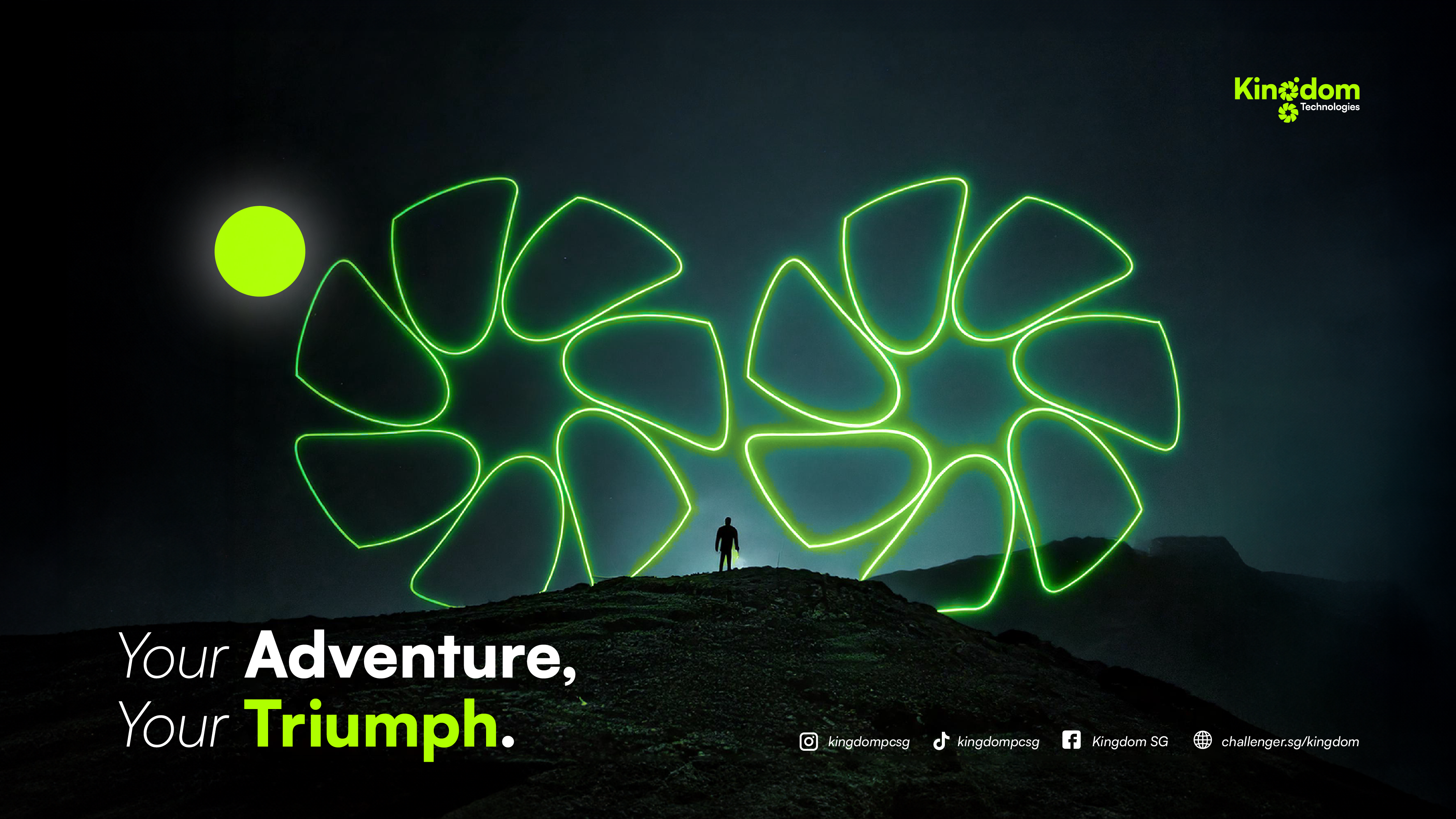
In this self-initiated rebranding exercise, the logo was refreshed, and the fan blades were reimagined with a new purpose and a compelling narrative.
Kingdom Technologies is a gaming-focused brand specialising in gaming PCs. Founded in 2021 as a subsidiary and investment arm of Singapore’s only homegrown consumer electronics chain, Challenger Technologies, the brand builds on the strong legacy of Challenger Technologies, which has been established since 1982.
In this self-initiated rebranding exercise, the logo was refreshed, and the fan blades were reimagined with a new purpose and a compelling narrative.
The fan blades have been repurposed and renamed as the Nexus Blade.
Each blade serves as a gateway to different gaming worlds, offering players the choice to enter and conquer the fantasy realm of their preference.
![]()
Each blade serves as a gateway to different gaming worlds, offering players the choice to enter and conquer the fantasy realm of their preference.
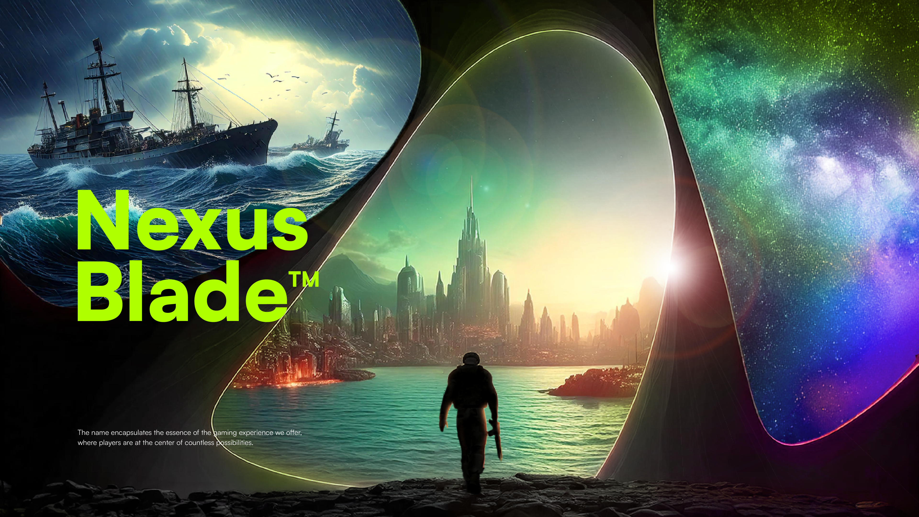
Nexus symbolizes a hub or central point where multiple worlds converge, representing the infinite realms of gaming that players can explore and dominate. Blade ties back to the core visual of our brand, where the fan blades of a gaming PC form the foundation of our graphic device, symbolizing power, precision, and movement. Incorporating AI-driven imagery elevates the
brand's storytelling, enhancing the imagination of gamers.
![]()
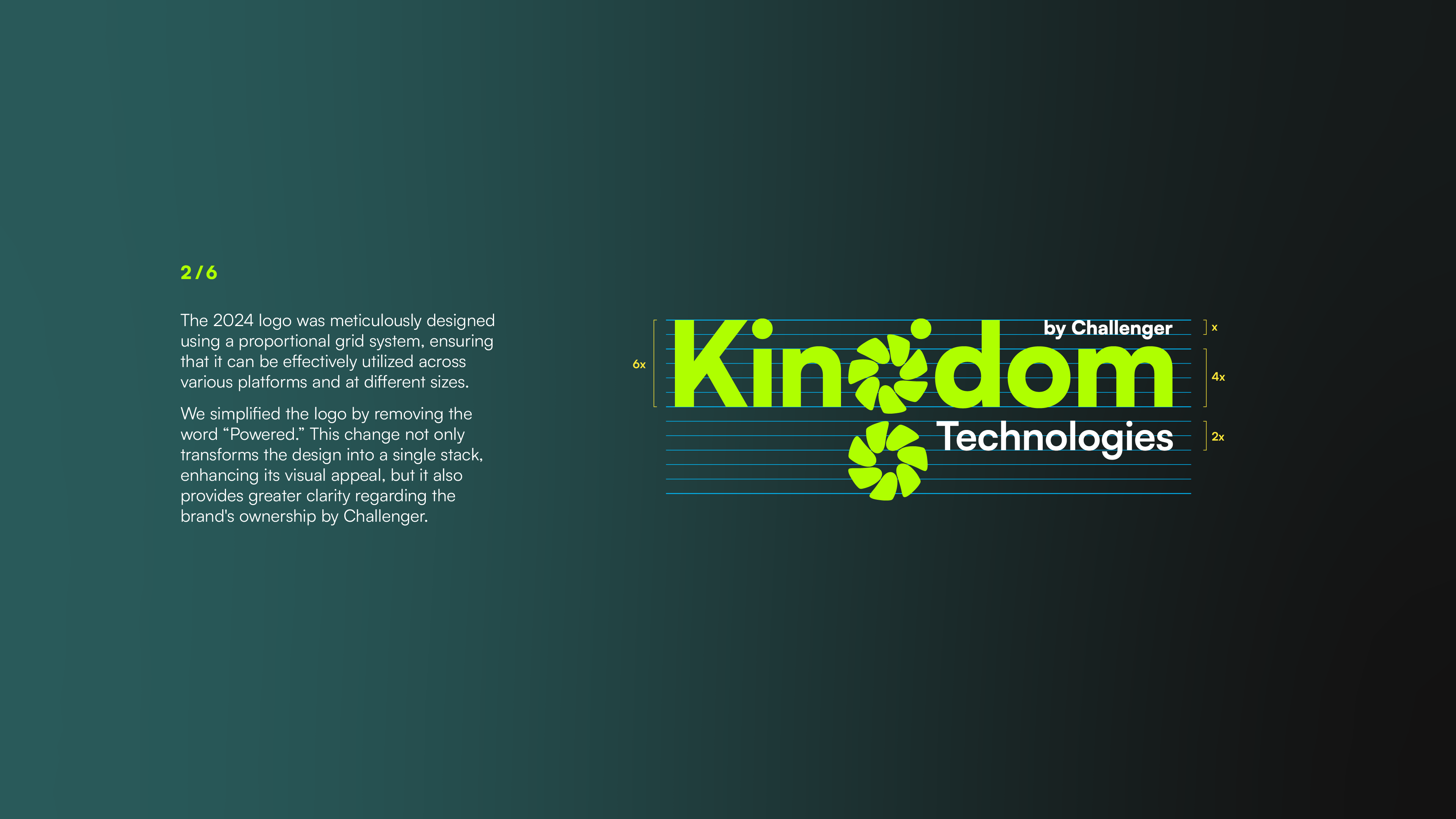
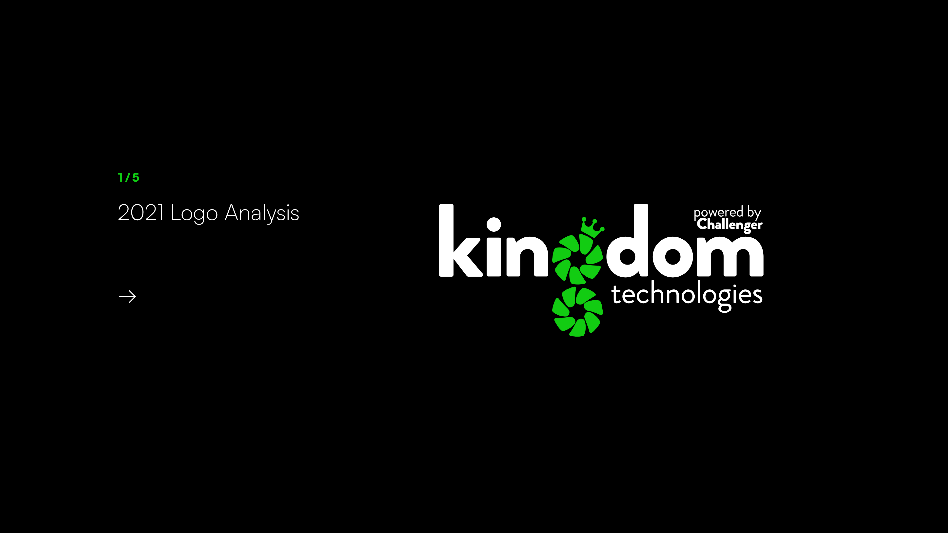
Updating the logo
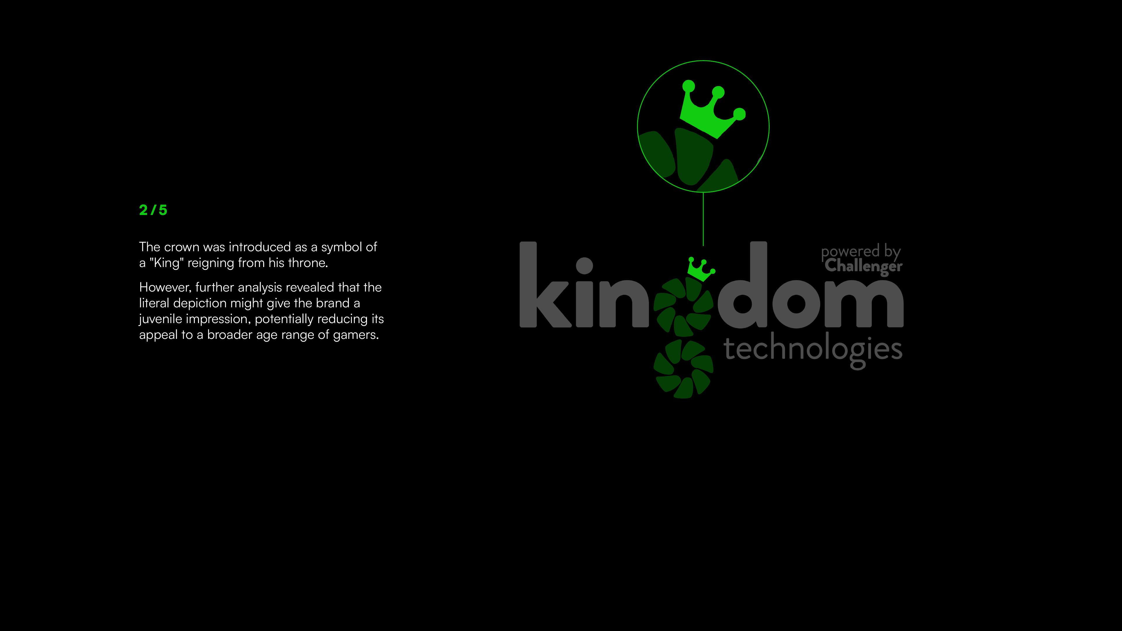
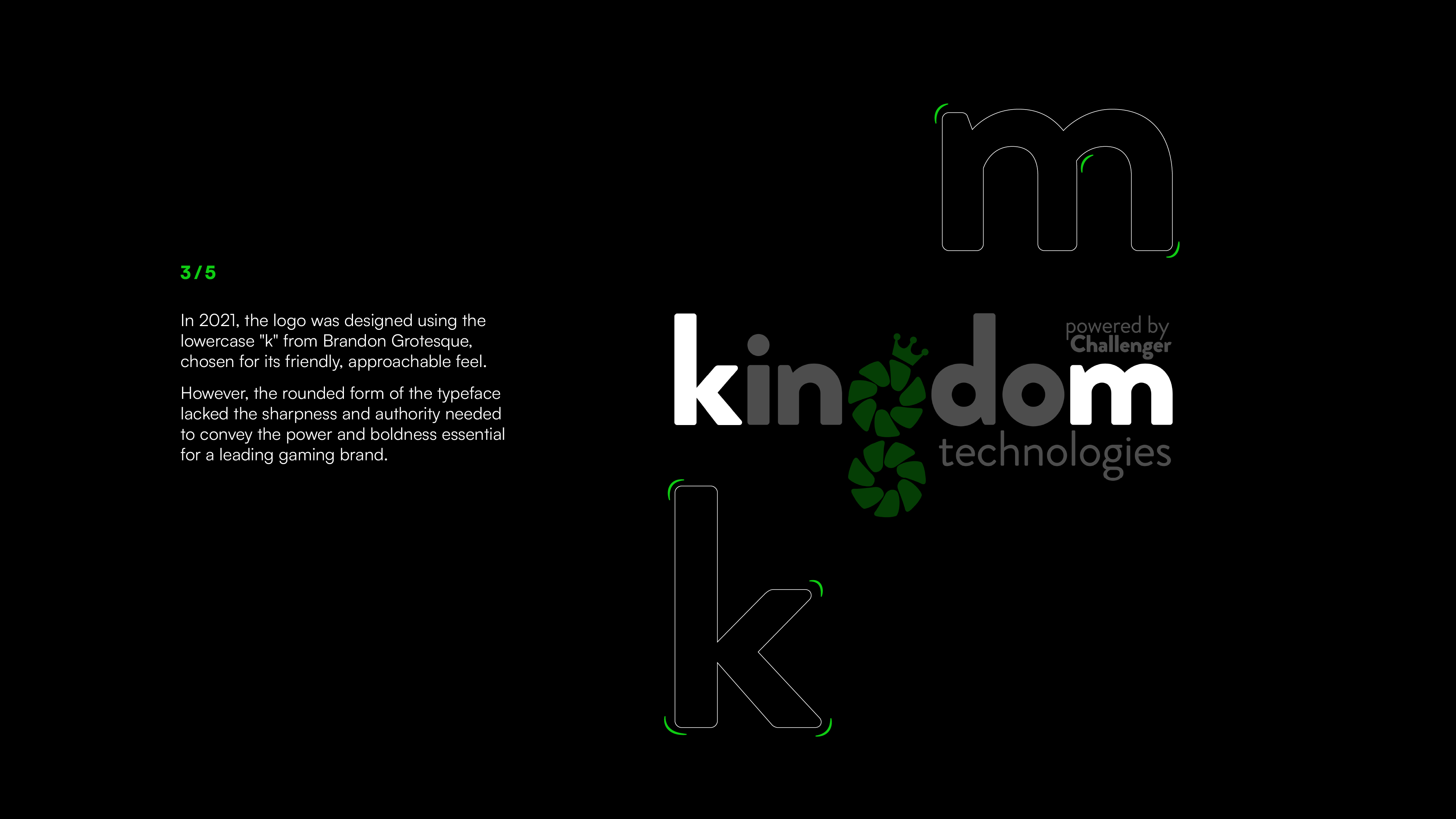
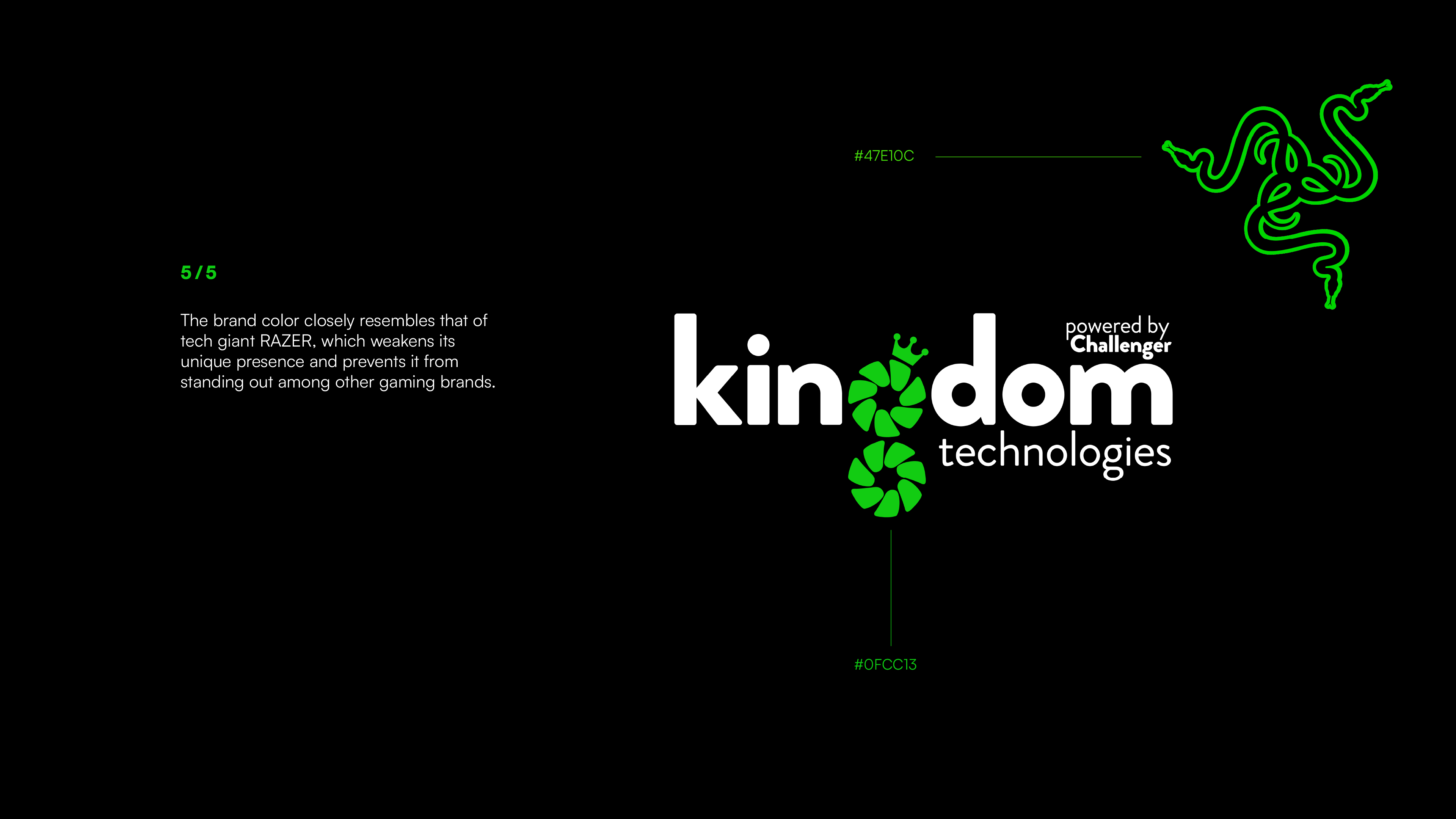
The 2021 logo was designed with the idea of a gaming computer as “the king of machines,” symbolising unmatched power and performance. The “g” in the wordmark was inspired by the iconic fan blades of gaming PCs, emphasising the brand’s focus on high-performance gaming technology.
In the 2024 logo, the fan blades were not only given a new purpose with a fresh narrative but were also refined with intricate details.
Read the analysis of both logos below to discover how this transformation was achieved.
Updating the logo
The 2021 logo was designed with the idea of a gaming computer as “the king of machines,” symbolising unmatched power and performance. The “g” in the wordmark was inspired by the iconic fan blades of gaming PCs, emphasising the brand’s focus on high-performance gaming technology.
In the 2024 logo, the fan blades were not only given a new purpose with a fresh narrative but were also refined with intricate details.
Read the analysis of both logos below to discover how this transformation was achieved.