Sour, Streetwise, Seoulful: The Making of KOMU
Client: KOMU
Art Direction and Branding by Shyon Toh.

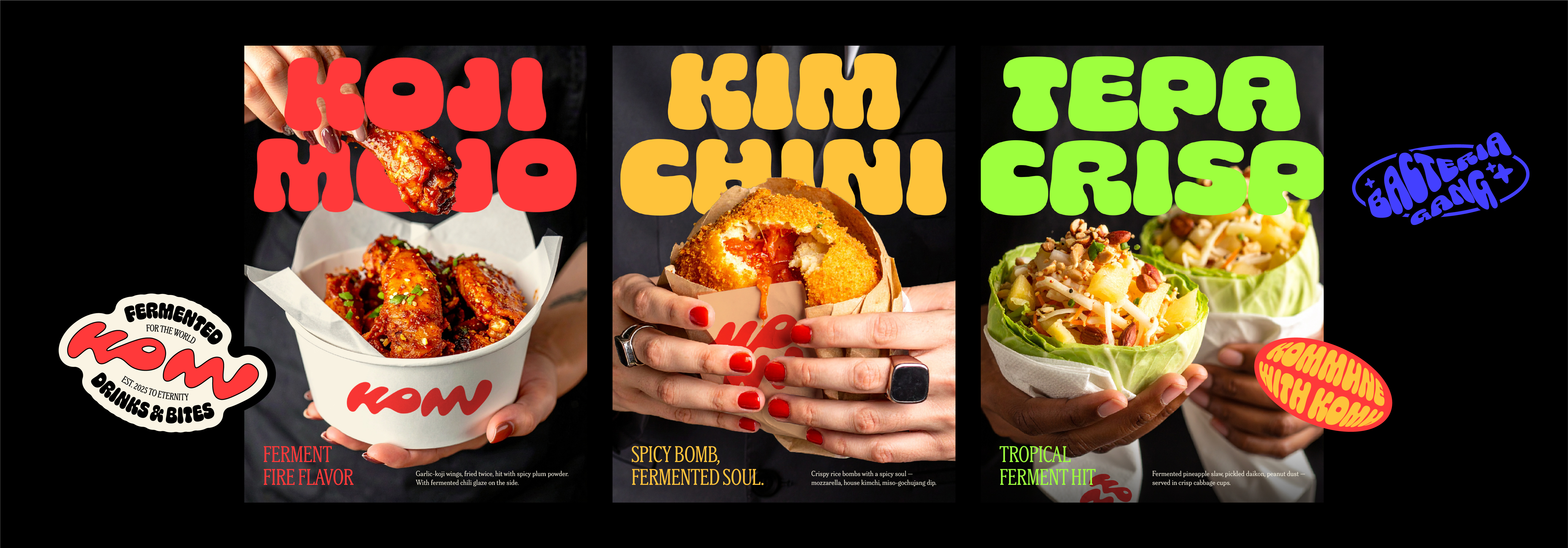

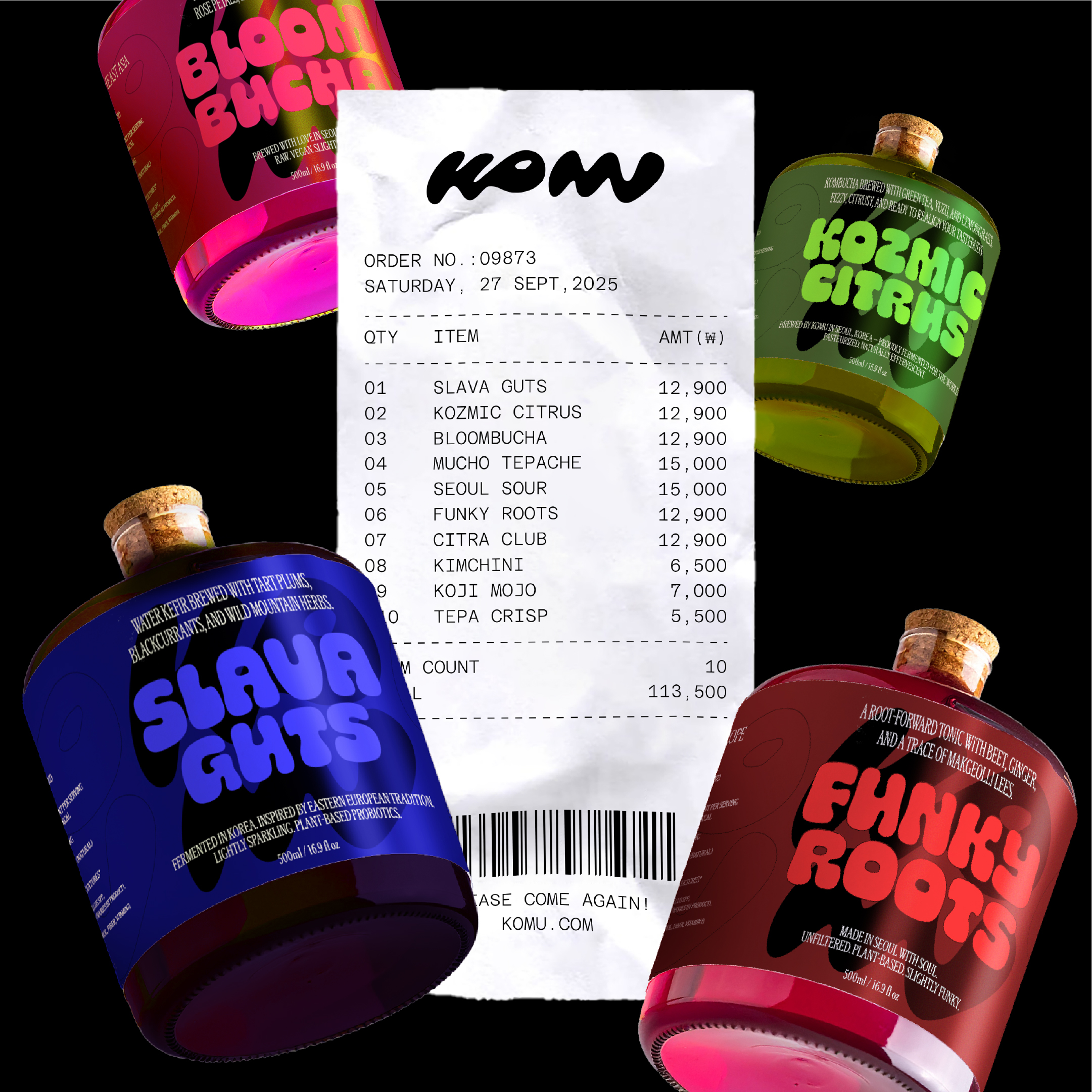

KOMU is a modern fermentation kitchen based in Seoul, crafting small-batch fermented drinks and bites rooted in global techniques: from Korean kimchi to Mexican tepache to Eastern European kvass. Soulful, vibrant, and globally minded, KOMU set out to reframe fermentation as more than just a culinary method. Here, it becomes a language of culture, wellness, and community—shared through flavor.
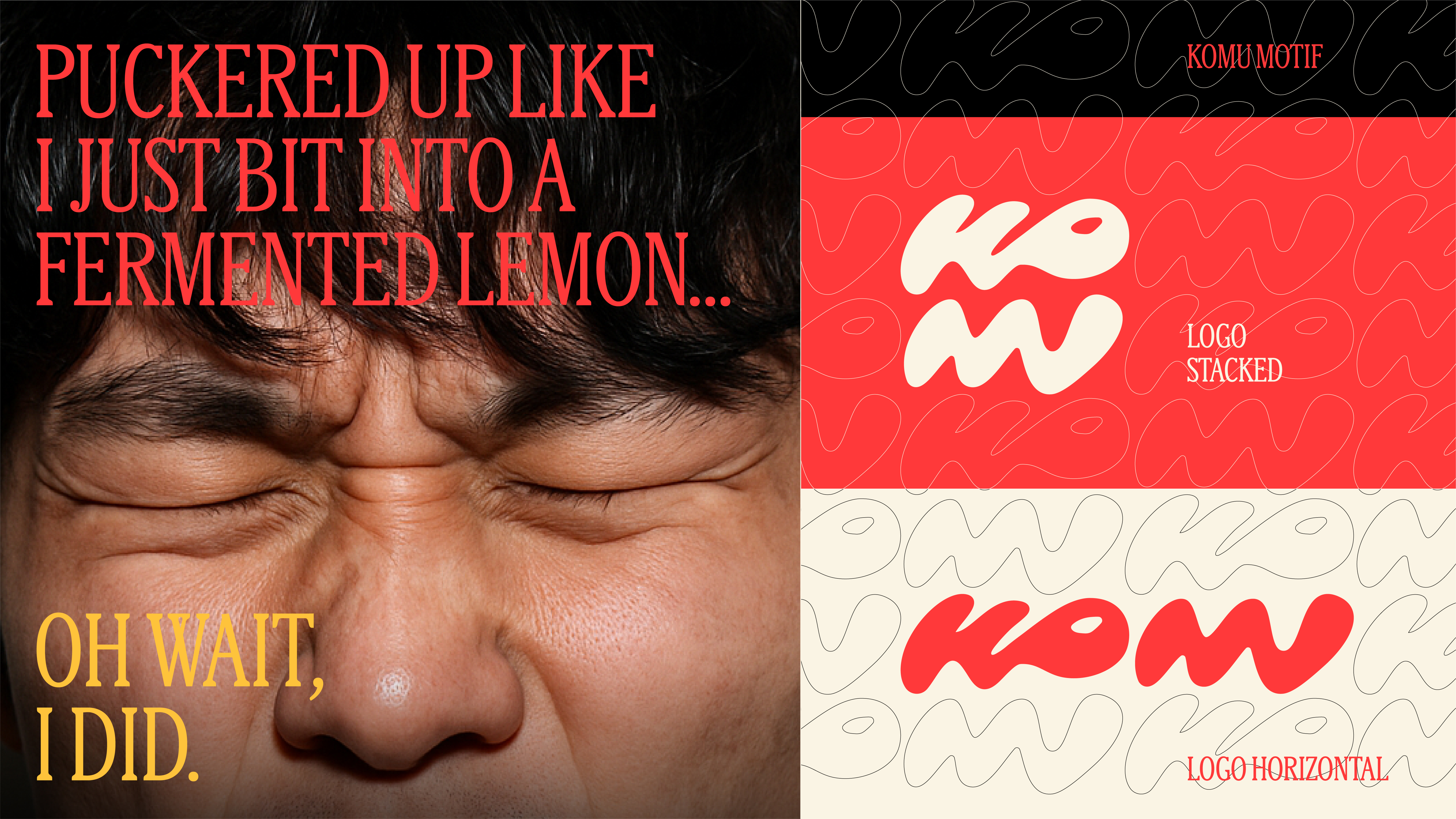
The brand name "KOMU" echoes the word komun (commune/community), reflecting its spirit of cross-cultural connection and openness. The visual identity features a modular wordmark designed to work both horizontally and stacked. Its natural, organic letterforms subtly reference the invisible world of fermentation: microbial, rhythmic, and alive, anchoring the brand in a visual language that’s as expressive and flavorful as its offerings.
The brand name "KOMU" echoes the word komun (commune/community), reflecting its spirit of cross-cultural connection and openness. The visual identity features a modular wordmark designed to work both horizontally and stacked. Its natural, organic letterforms subtly reference the invisible world of fermentation: microbial, rhythmic, and alive, anchoring the brand in a visual language that’s as expressive and flavorful as its offerings.